CORE UI Documentation Site
Overview
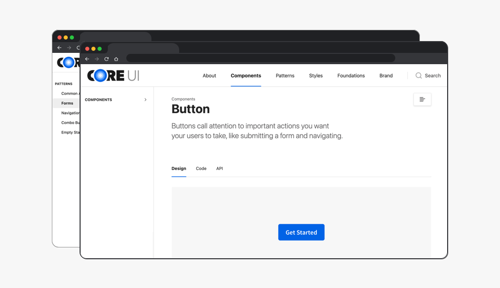
Epsilon has a robust design system, CORE UI, which is accurately named because this design system is at the core of every one of Epsilon’s products. But documentation surrounding the design system was limited and confusing, so the benefits of having such a complex design system were not as far-reaching as they should be.
The Problem
The current documentation site had poor navigation (no search functionality), the breadth and depth of documentation was lacking, and there were no design patterns documented on the doc site.
Poor documentation leads to unproductive meetings and wasted time.
To solve these problems, I proposed a complete overhaul of the CORE UI documentation site.
Why invest in a better doc site?
A design system is a product. Even though clients don’t use it, CORE UI and the CORE UI doc site are used by every member of the Engineering team and should have the same investment as client-facing products.
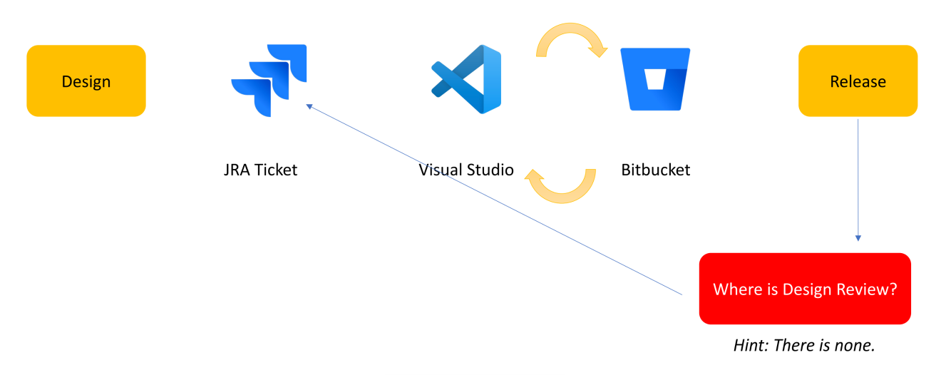
Since we were using a custom site with no CMS, something as simple as a text change could take days or weeks because it needed to go through development. Putting in time to improve the site now would save time and money in the future.
Creating a better CORE UI documentation site would lead to:
- More productive meetings
- Improved communication
- Increased overall understanding of CORE UI
- Reusable content
- Better recruiting
Part Two: User Research
SUS Survey
In order to prove the need for a new doc site, we first assessed the usability of the current site. The goal of the SUS survey was to measure satisfaction with the CORE UI doc site for the Engineering team.
Users rated usability from 1–5 (strongly disagree to strongly agree). Product Designers rated the site at a median SUS score of 67.5 (below average) and Product Engineers at 70 (above average).
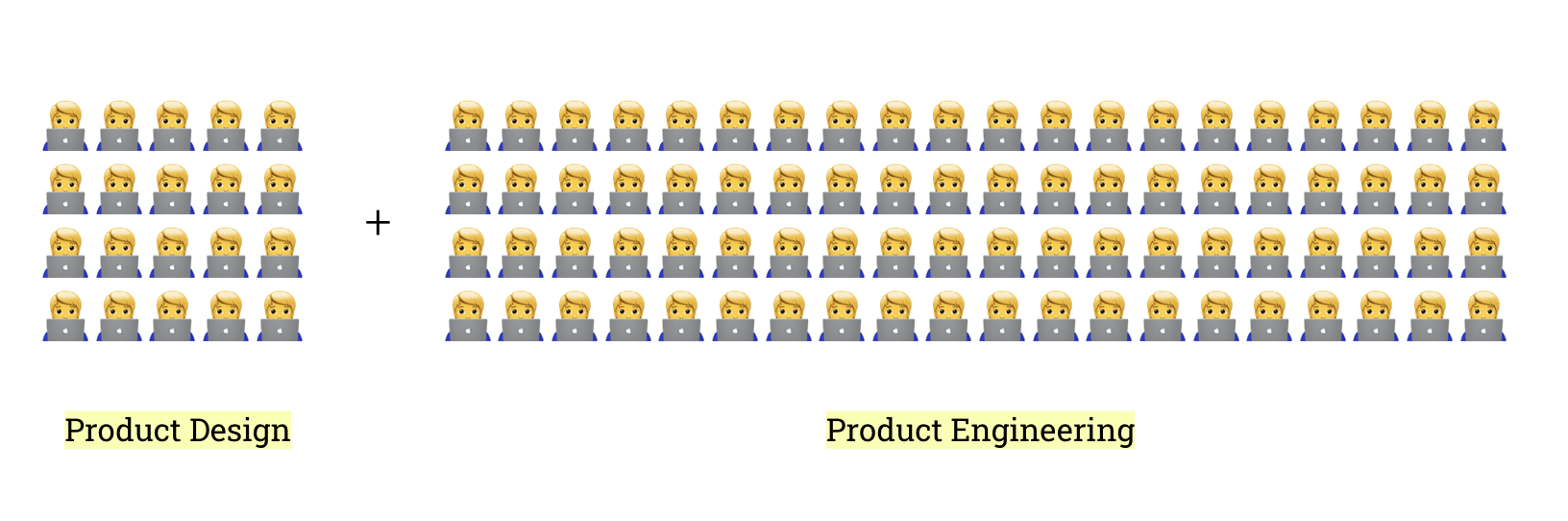
When broken down by proficiency level, engineers with basic proficiency had an average SUS score of 61.66, which is below average. Advanced users were more confident with the system, but beginners needed more assistance. A below-average SUS score supported the need for a better documentation site.
Competitor Analysis
We researched five of the top design system documentation sites in the industry to see how they compared to CORE UI: Salesforce Lightning, IBM Carbon, Google Material Design, Atlassian, and HPE.
We evaluated sites across component pages, foundations, navigation, brand, design guidelines, and code.
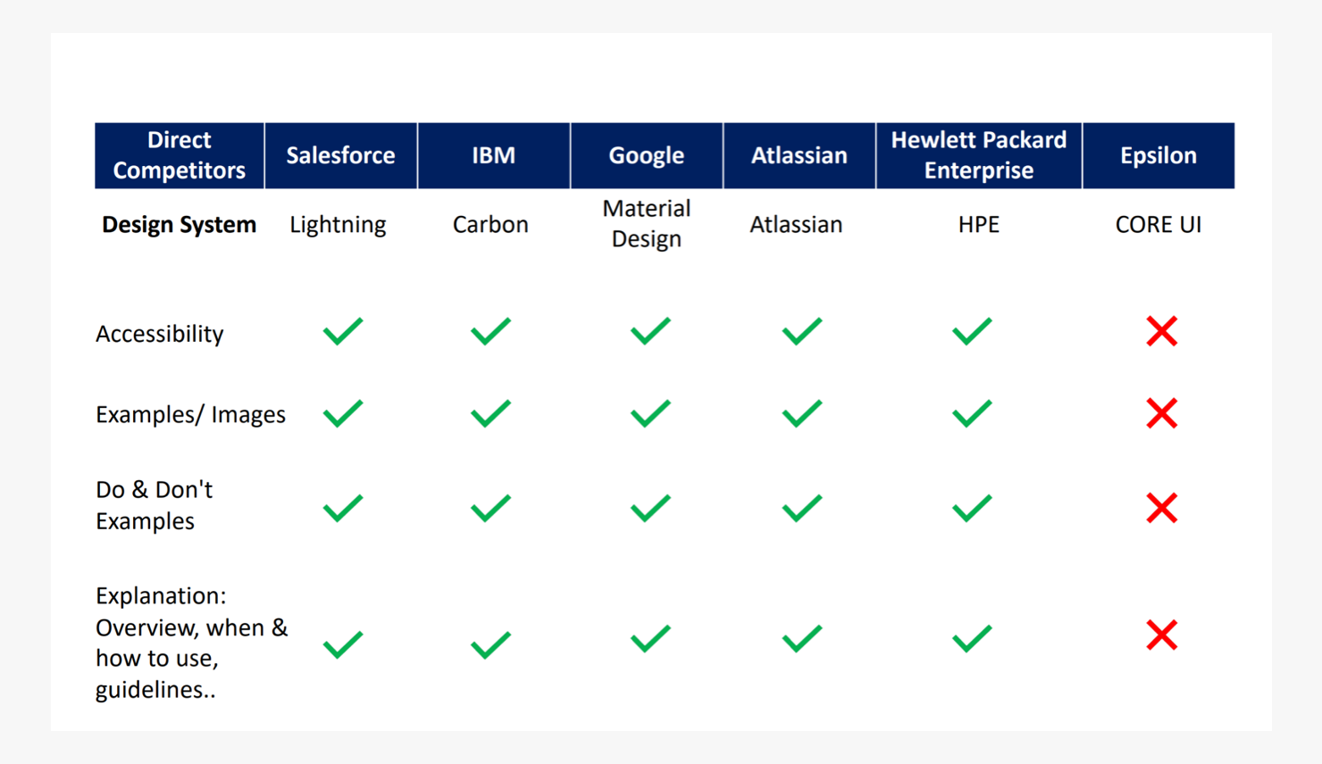
All design system doc sites except CORE UI shared the same core component-page features, including Do’s and Don’ts.
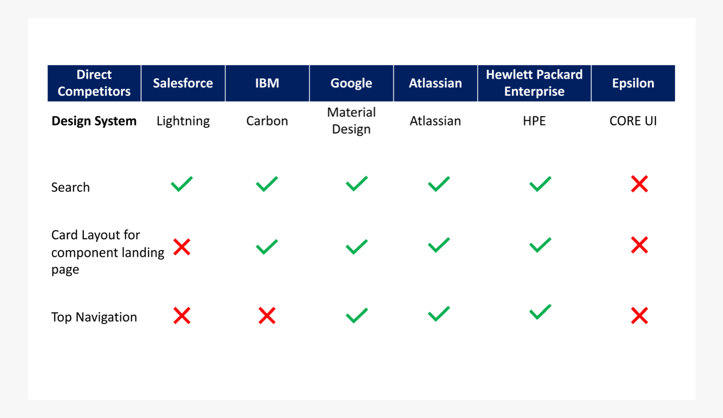
All of them also had similar layouts and navigation, including a search feature.
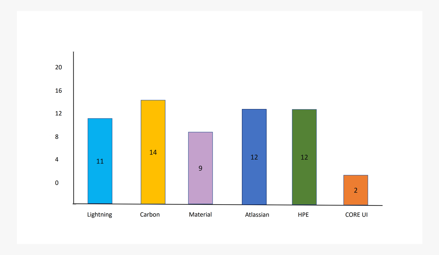
Across six categories and 16 features total, CORE UI had significantly fewer features than the best documentation sites in the industry, which further supported the need for a new site.
Part Three: Execution
Design System Management Tools
Further research determined that the best tools to support a better documentation site were Storybook and Zeroheight.
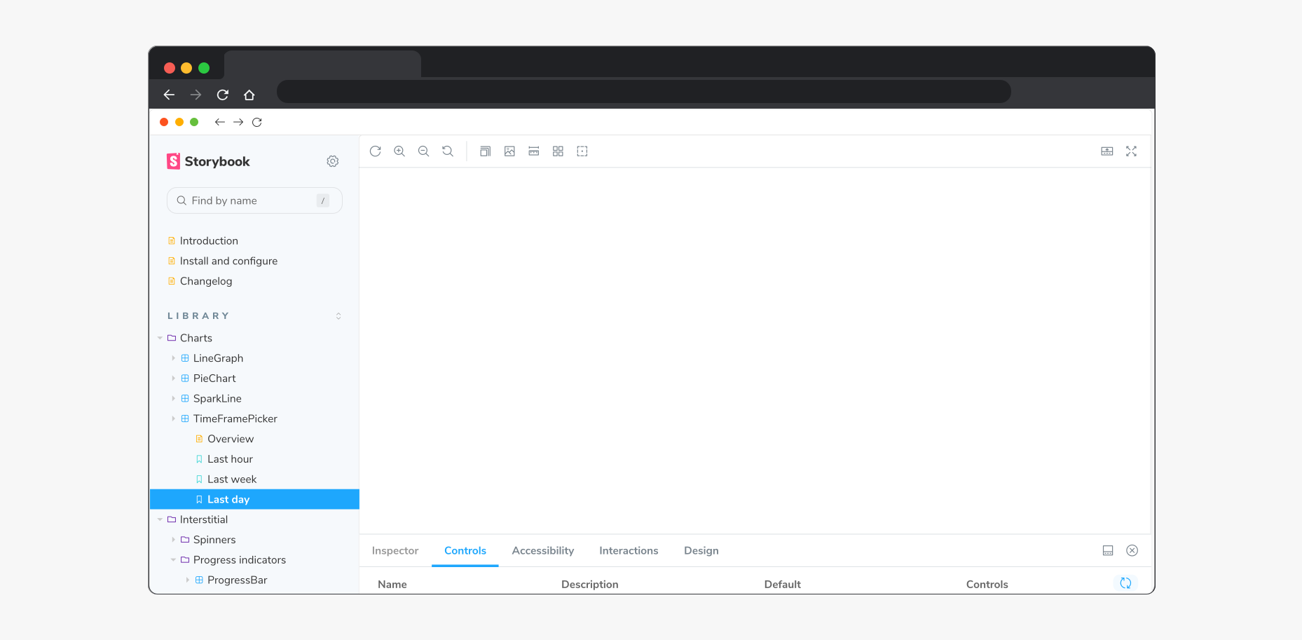
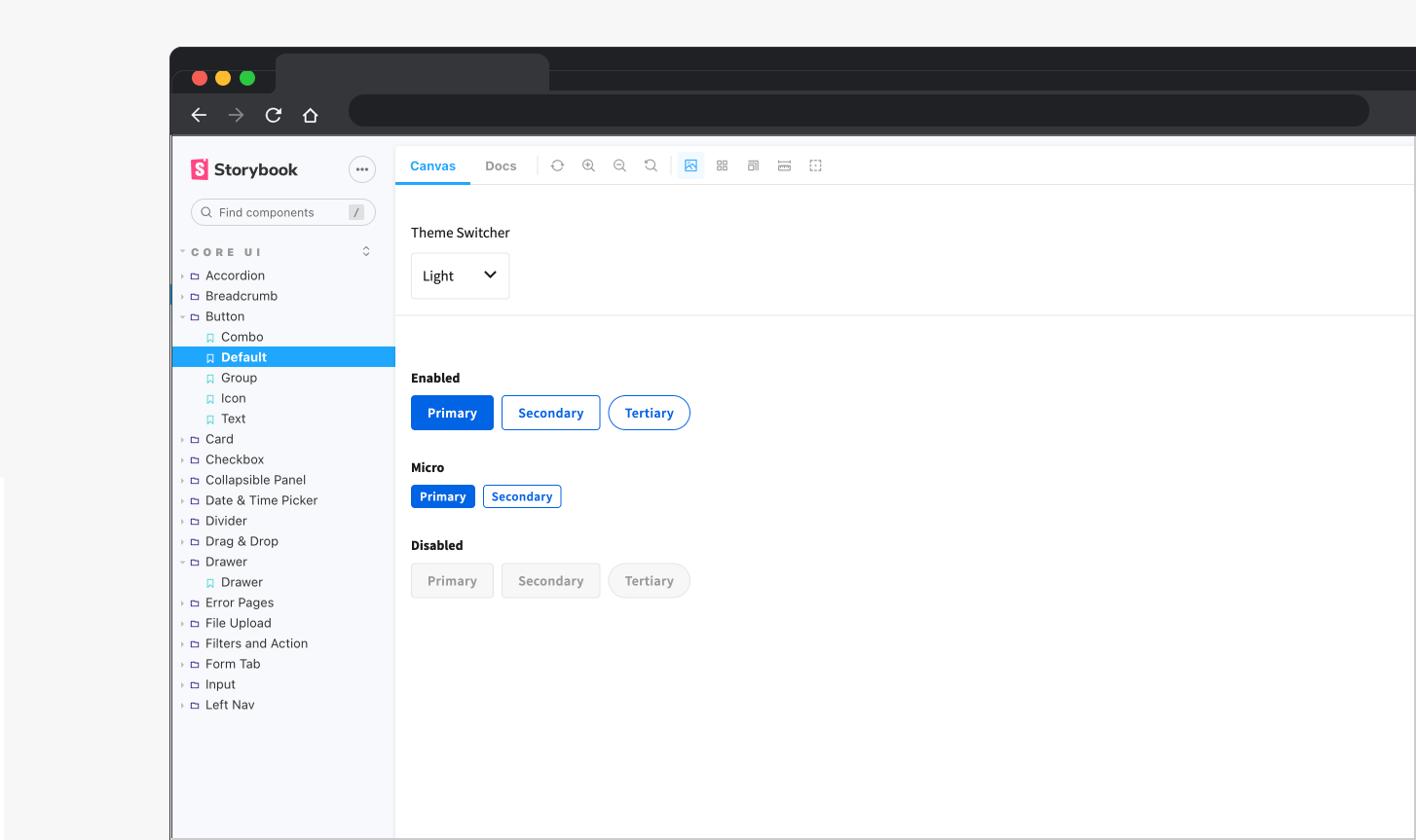
Storybook is a free, open-source project used as a workshop to build and test UI components in isolation, and as a styleguide to document UI component usage.
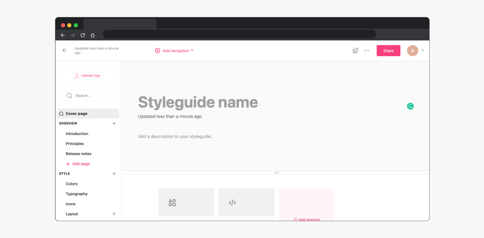
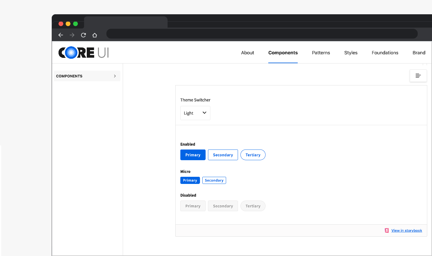
Zeroheight is a documentation CMS that provides search, keeps design resources in one place, outlines principles of the design system, and lets anyone on the team create or update pages without development.
Developers built out the components in Storybook so we could embed them as iframes in Zeroheight.
Components
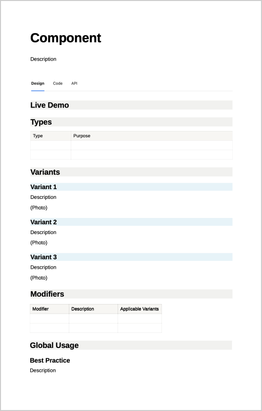
With 40+ components, the best plan for writing documentation was to create a standard page template that every component would follow.
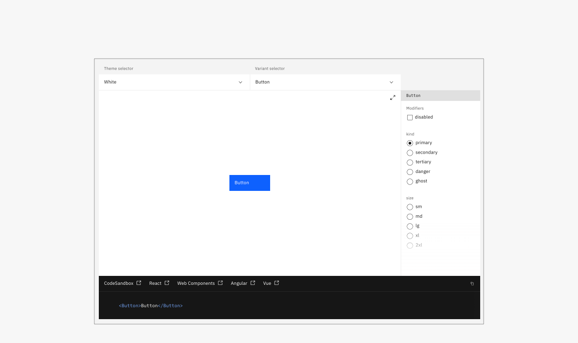
Our ultimate goal was that every component page would lead with a live demo similar to Carbon, so we organized content to mirror what is presented in the live demo.
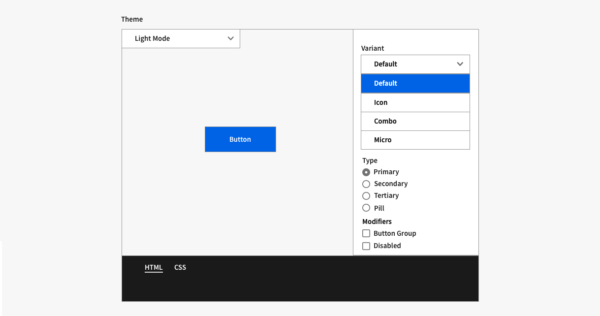
This organization structure needed to work for all components, so we whiteboarded several others to test the formula, including Cards and Date and Time Picker.
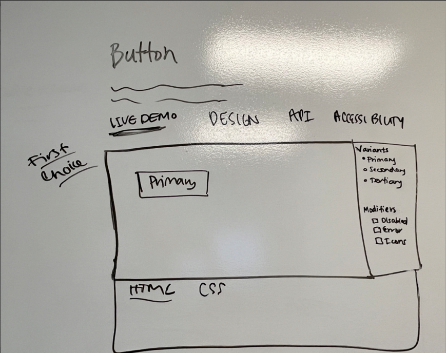
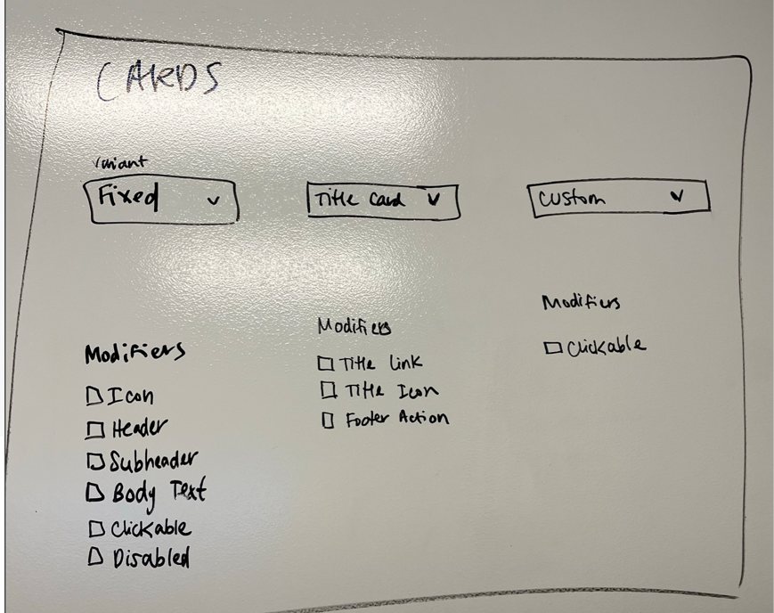
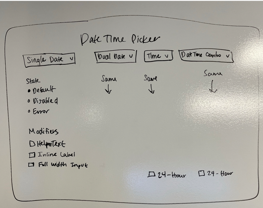
We used the wireframe below to make a page template.
Design Patterns
We looked at other documentation sites to find what patterns other design systems focus on, and came up with our own list:
- Common Actions
- Messaging
- Empty States
- Forms
- Navigation
Another designer created a document outlining how we would fit old Design Pattern Library content into the new structure.
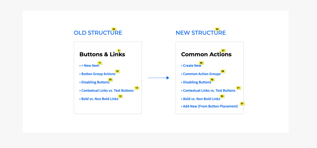
New Sitemap
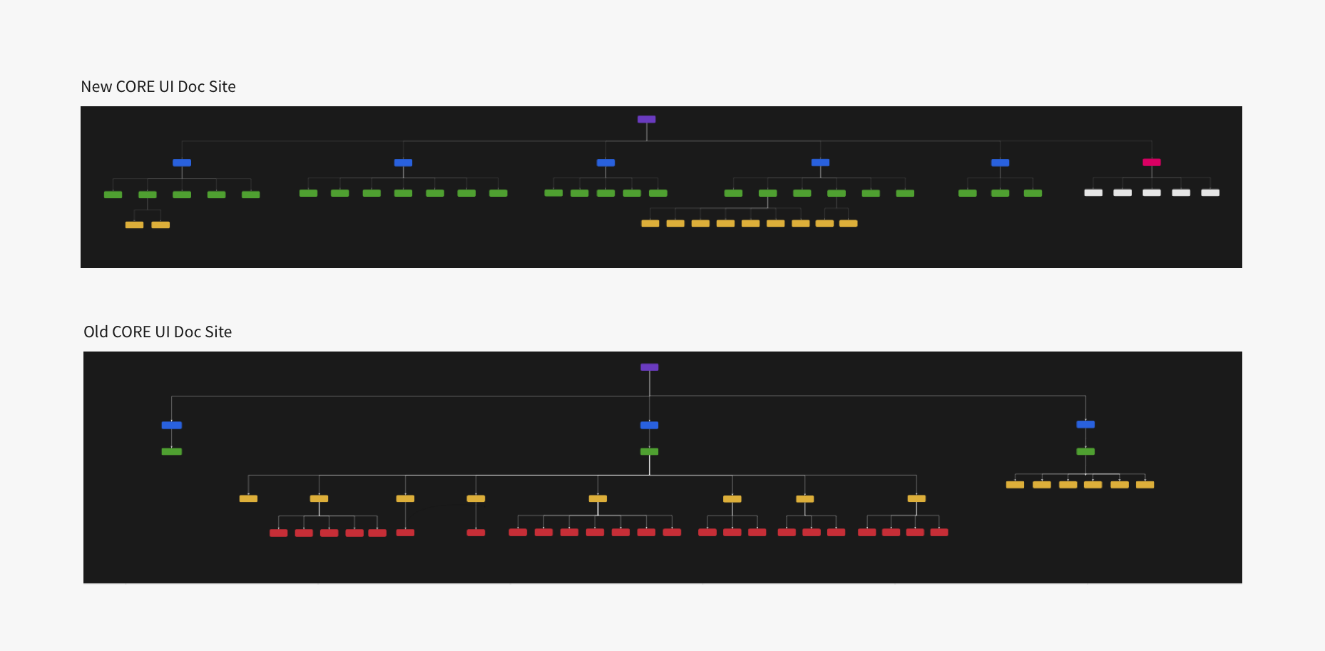
I made sitemaps in Miro to compare the old doc site structure with the proposed new structure. The new structure utilizes the top-level nav, whereas the old site relied heavily on the left nav.
Component Pages
Major improvements were made to component pages. Examples from the Buttons page:
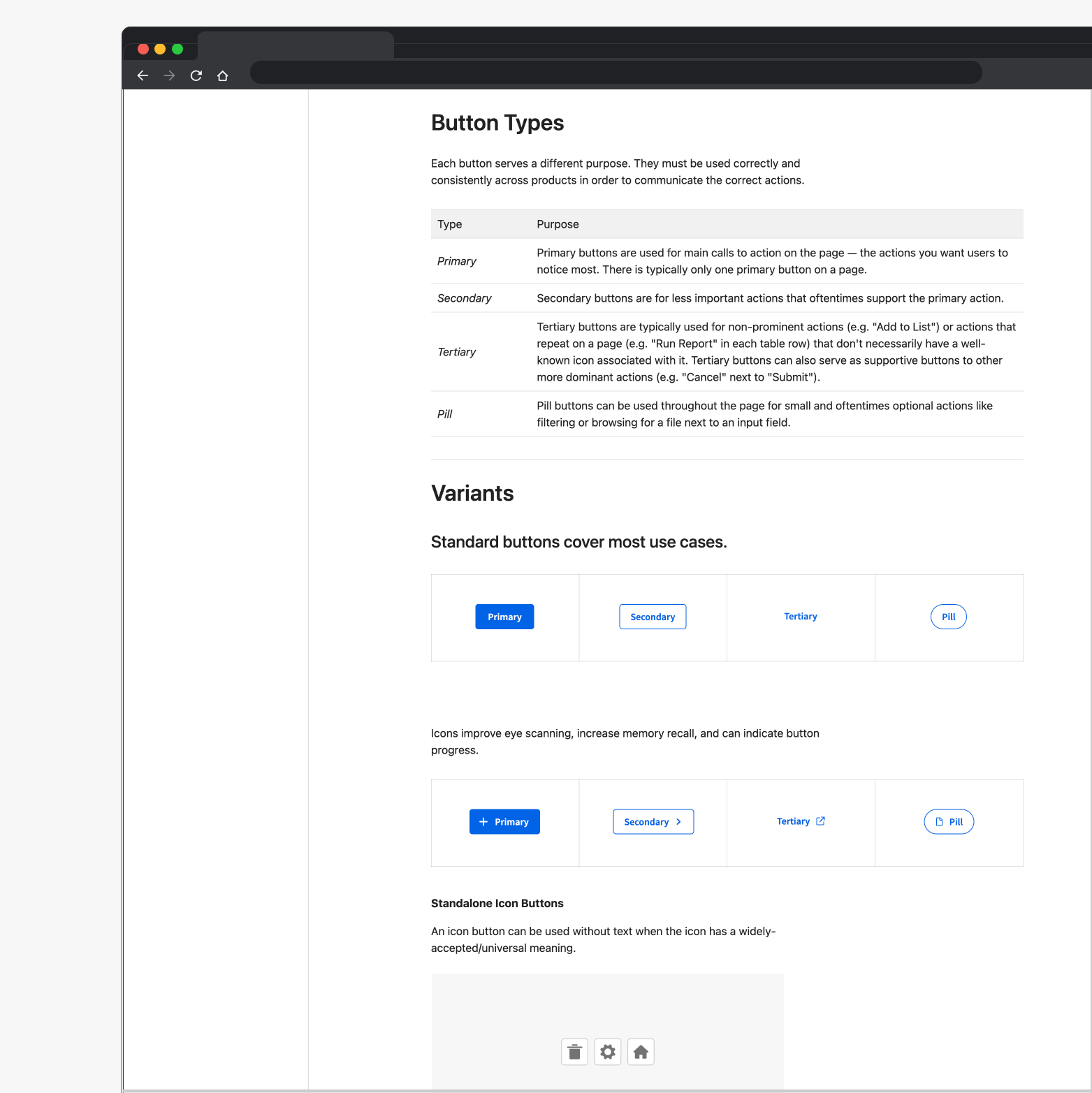
Component types and variants are thoroughly documented and explained.
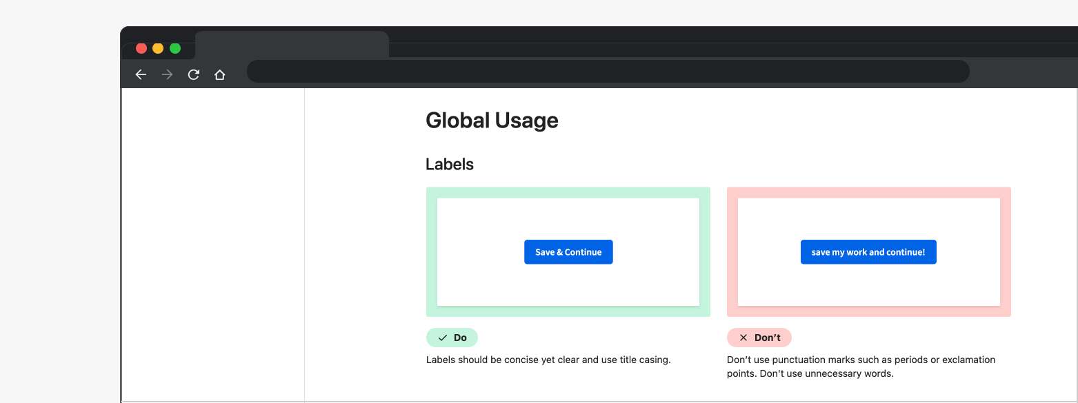
Do’s and Don’ts are included to provide more clarity.
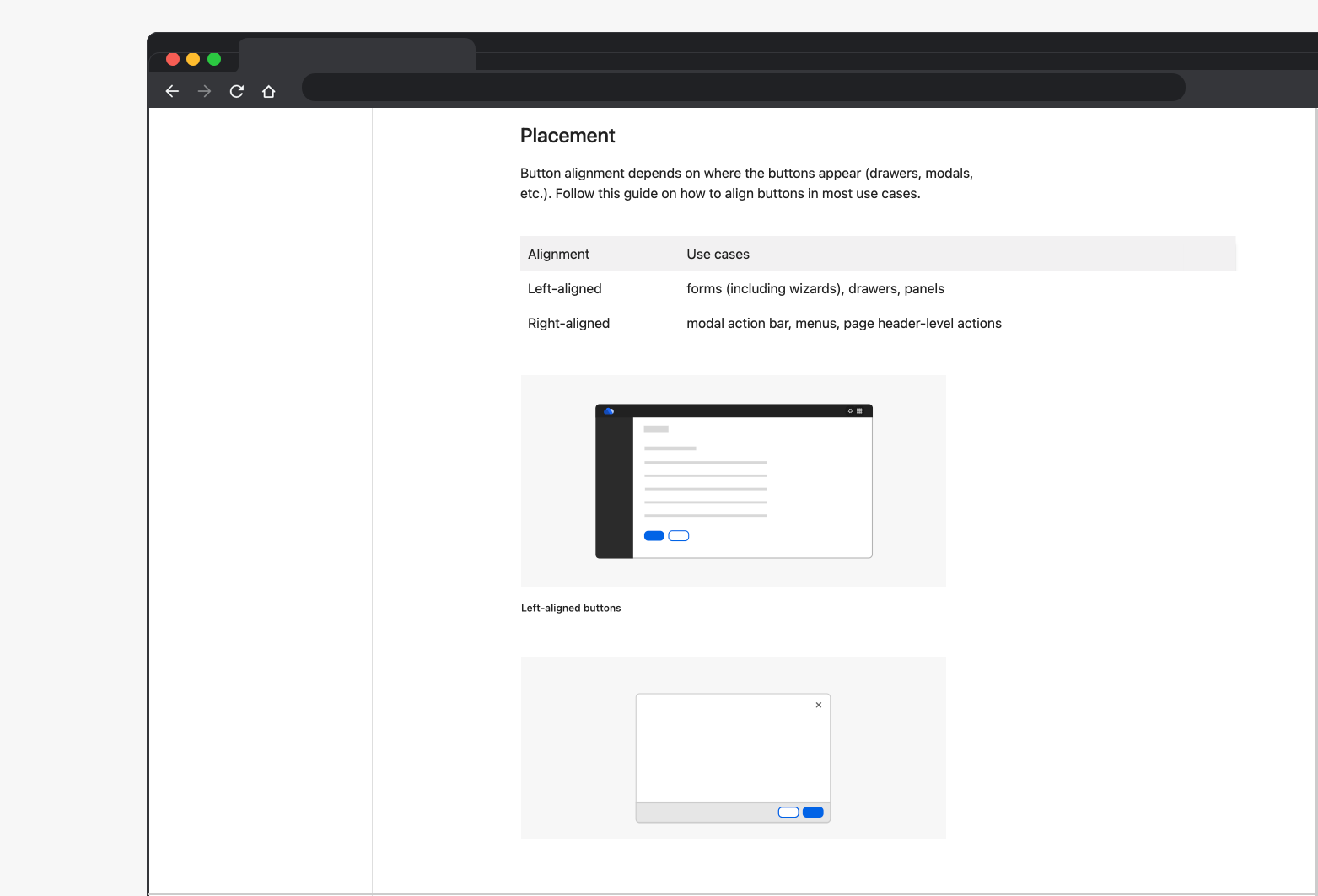
Components are explained with visuals for easier reading and scannability.
Design Patterns
Here is an example of the Common Actions page making difficult patterns easier to understand.
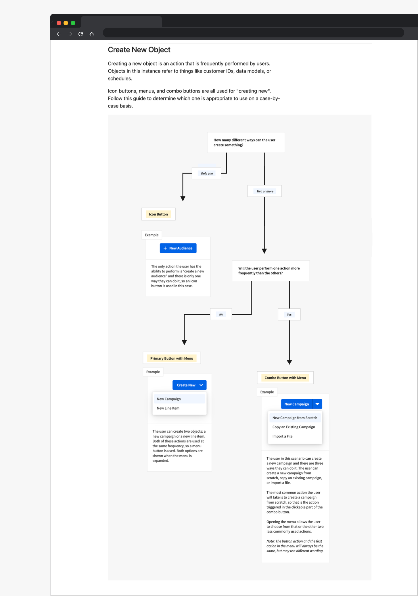
Outcome
The redesigned CORE UI documentation site was successfully launched and adopted by Epsilon’s design and engineering teams.
By integrating Zeroheight and Storybook, we created a centralized resource for design guidelines, component documentation, and interactive examples. Reusable documentation templates and a streamlined publishing process made it easier to maintain content, reduce dependency on engineering, and keep documentation up to date.