CORE UI Design System
Background
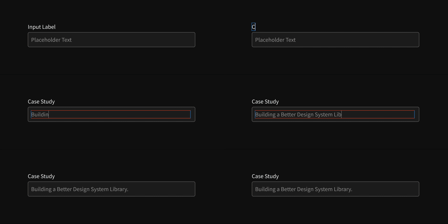
Epsilon’s Product Design Team is focused on creating the best apps for their customers possible using their design system CORE UI. But efficiencies that come with having a design system were getting lost because half the team (UI) was working in Sketch and the other half (UX) was working in Axure. Neither team was particularly happy with the software they were using, so in late 2023 a fellow designer and I proposed our entire team make the switch to Figma. Figma is more collaborative, user-friendly, and better for managing a design system.
The Challenge
A design system is a product and just like with any other product, the goal is to create the best user experience possible. Users of the design system library are our designers and we want to give them the best quality of life at their job possible. That means building a library that is robust, organized, and easy to apply. We wanted to avoid users needing to create the dreaded “detached instances” so components must be built with all use cases in mind.
- Team Size
- Four Designers
- Timeline
- ~2 months
Part 1 - Planning
UI Inventory
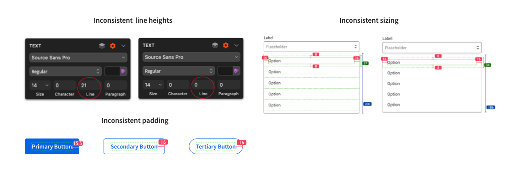
We started by going through our old design system library and finding any inconsistencies across our components that we needed to pay attention to when building a new library.
Prioritization of Components
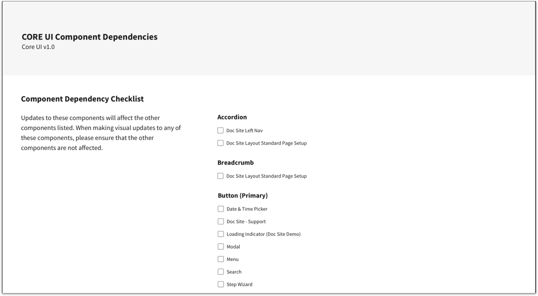
I put together a document that outlines the component dependencies in CORE UI. This document lists each component and where that component is being used.
CORE UI is a large design system and many components are built using other components from the system. This document was important to help us prioritize which components needed to be built first in our Figma library.
Researching Other Systems
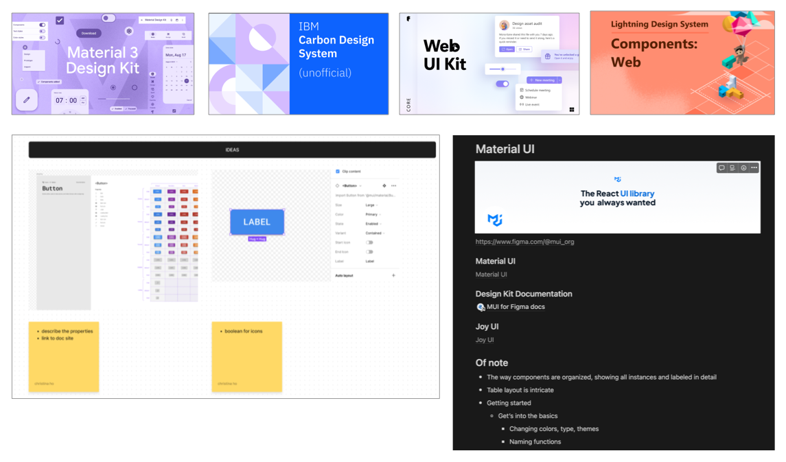
Figma has a big community which allowed us to research other design systems. We took a look at the Figma libraries of some of the best systems in the industry in order to get an idea of how to set ours up.
Part 2 - Foundations
Organization is one of the most critical parts of building a design system library. In order to make components as quickly and efficiently as possible, it was necessary to lay out some foundations.
We broke up the needs of our library into 6 files.
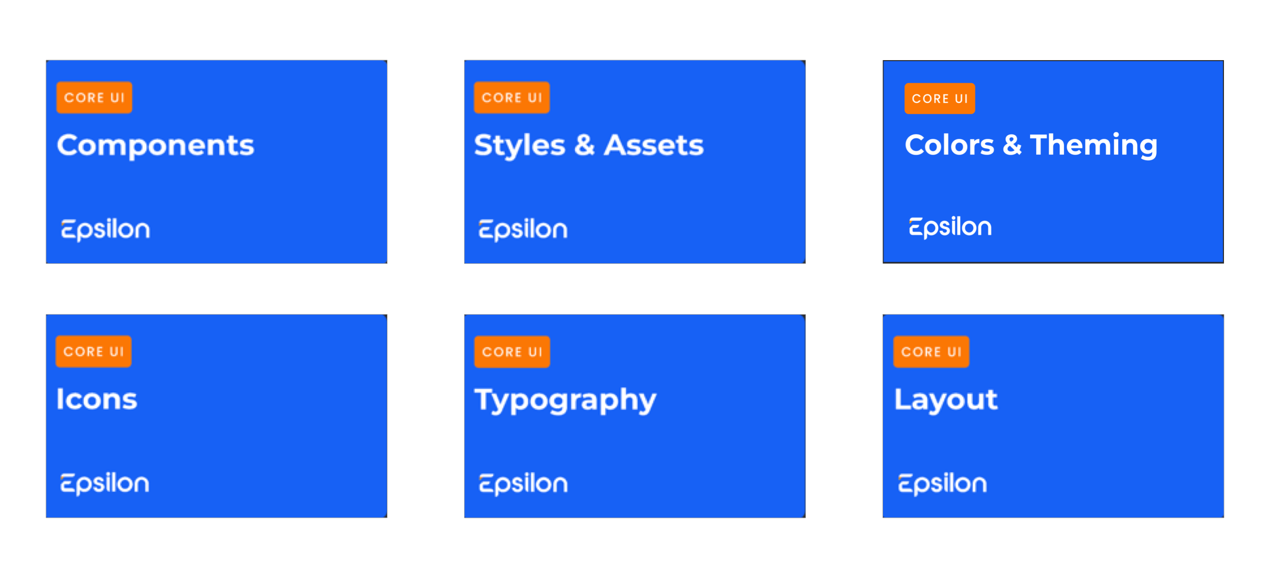
01 Components
This file is built using assets from all of the other files, so it is what we worked on last. We will come back to this.
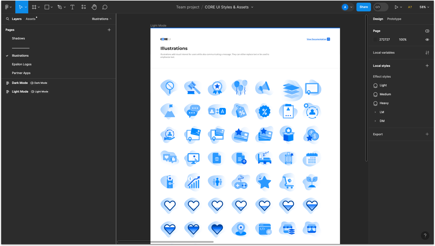
02 Styles & Assets
We added all drop shadows, illustrations, and logos used in Epsilon’s products to this file.
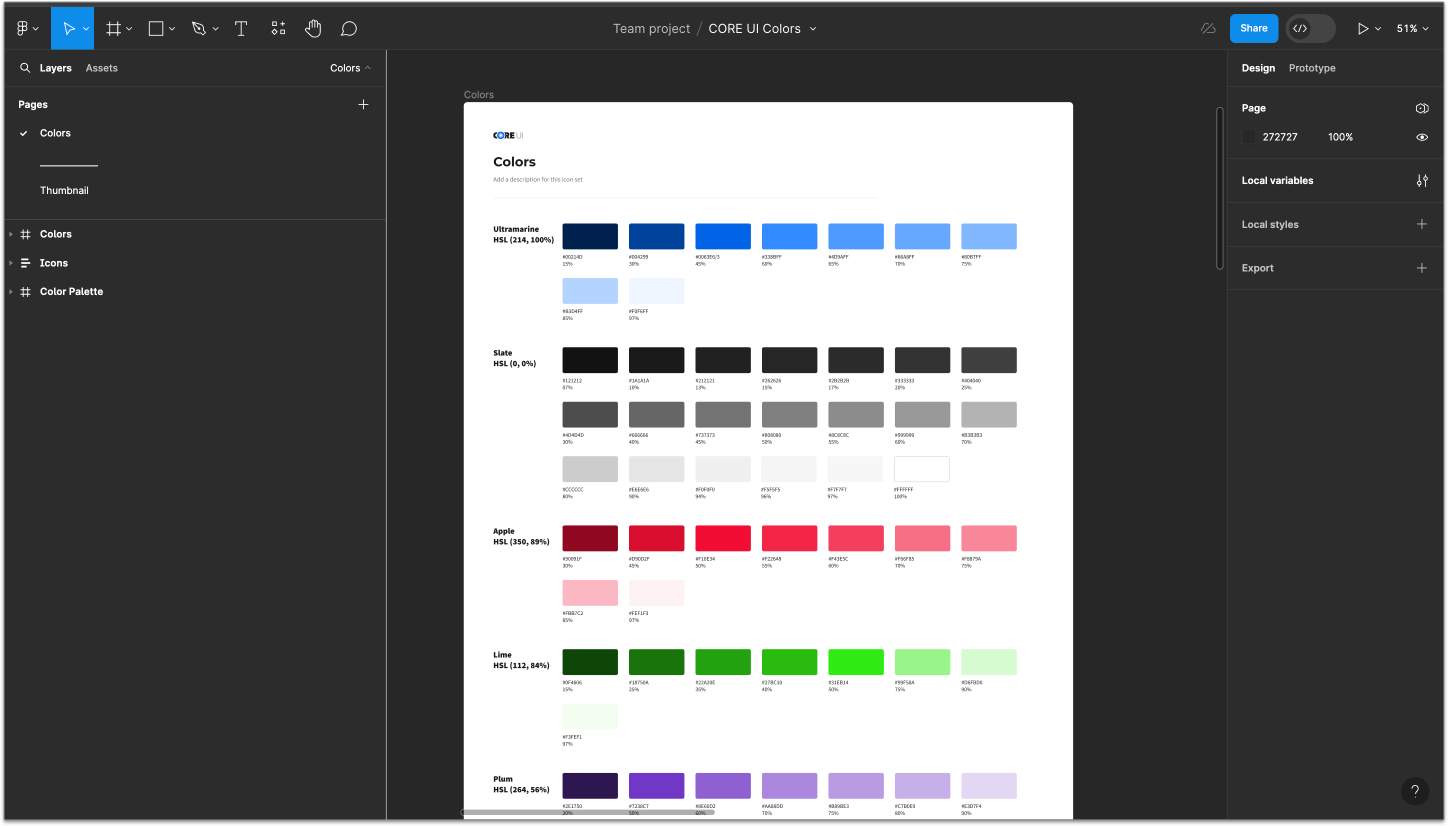
03 Colors & Theming
We added the CORE UI color palette to “Local styles”.
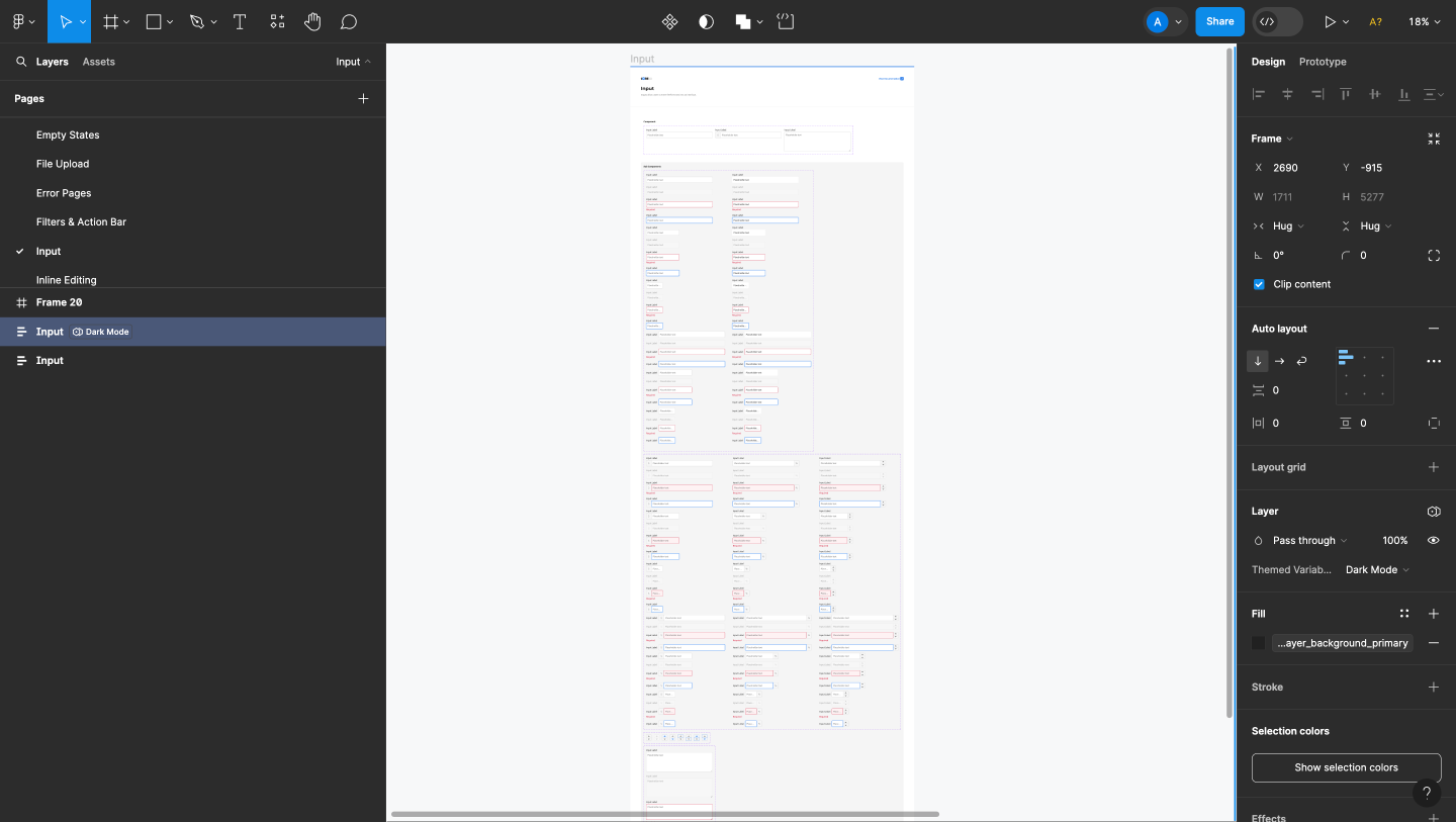
Next we used those colors to add tokens to the local variables in our file. Color tokens are style labels that are assigned to two color values — one for dark mode and one for light mode. Using tokens improves consistency across applications and allows for colors to be updated more efficiently by developers.
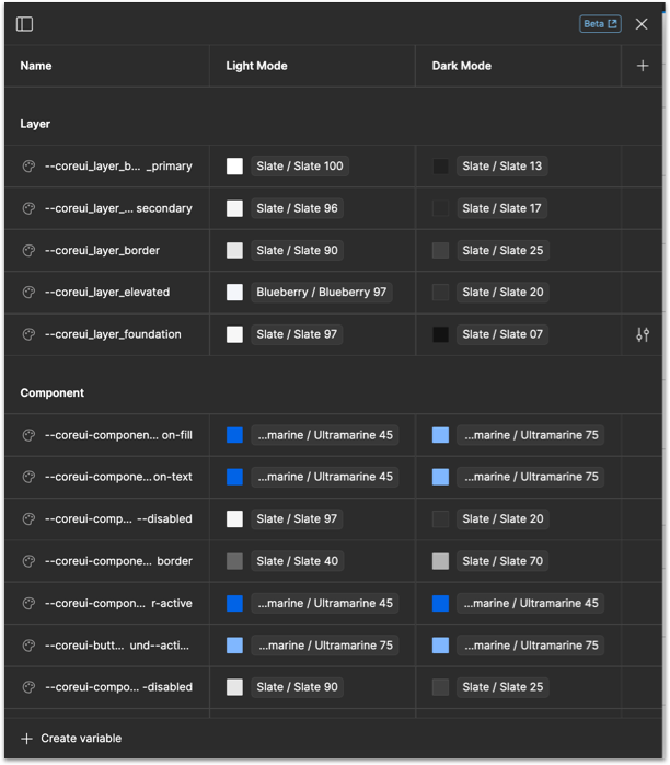
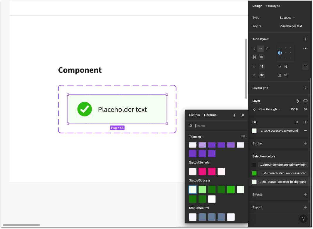
Utilizing tokens in a Figma design system library is also important for efficiency reasons. It is crucial that every layer of every component is attached to a design token so that when a color variable changes in our design system, that change occurs in every file where the token is being used.
Applying tokens to a design system in Figma also improves efficiency because only one version of the design system (light mode or dark mode) needs to be built. Users can easily switch between light and dark mode with the click of a button.
04 Icons
We created a file for the CORE UI icon library and categorized the icons into 17 categories.
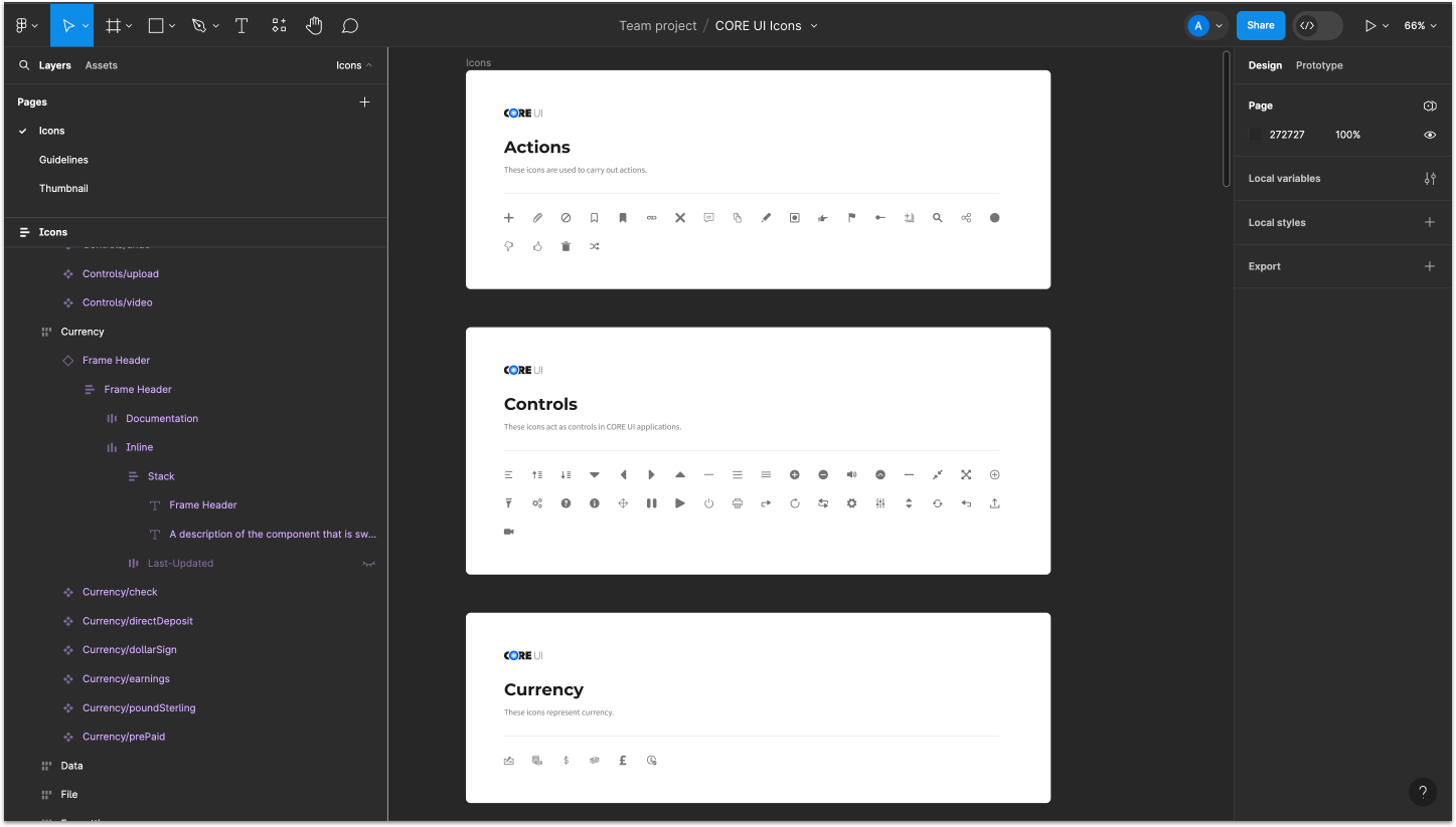
Categorizing the icons make them easier to find for designers.
05 Typography
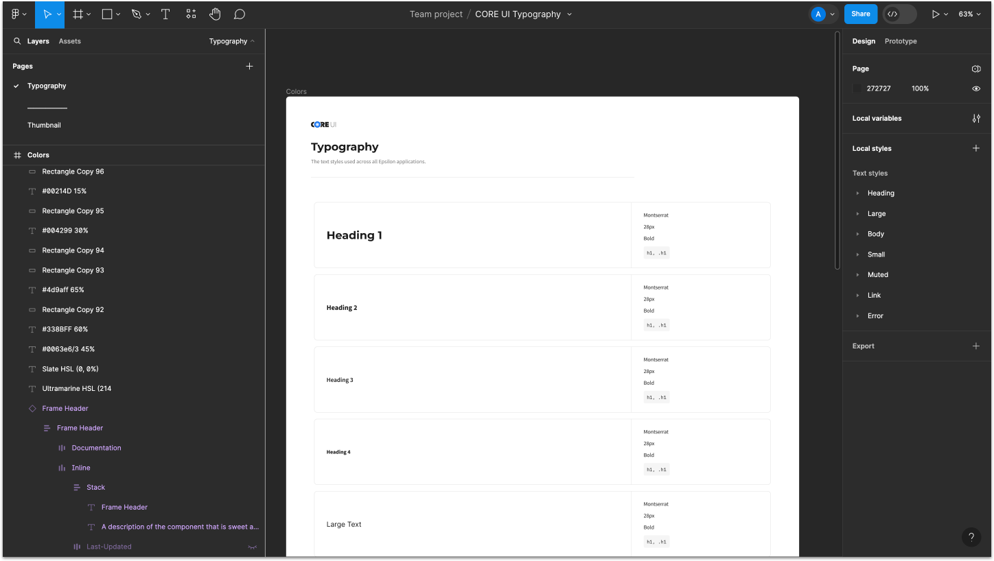
We added CORE UI typography to “text styles” so they can be attached to all design files.
06 Layout
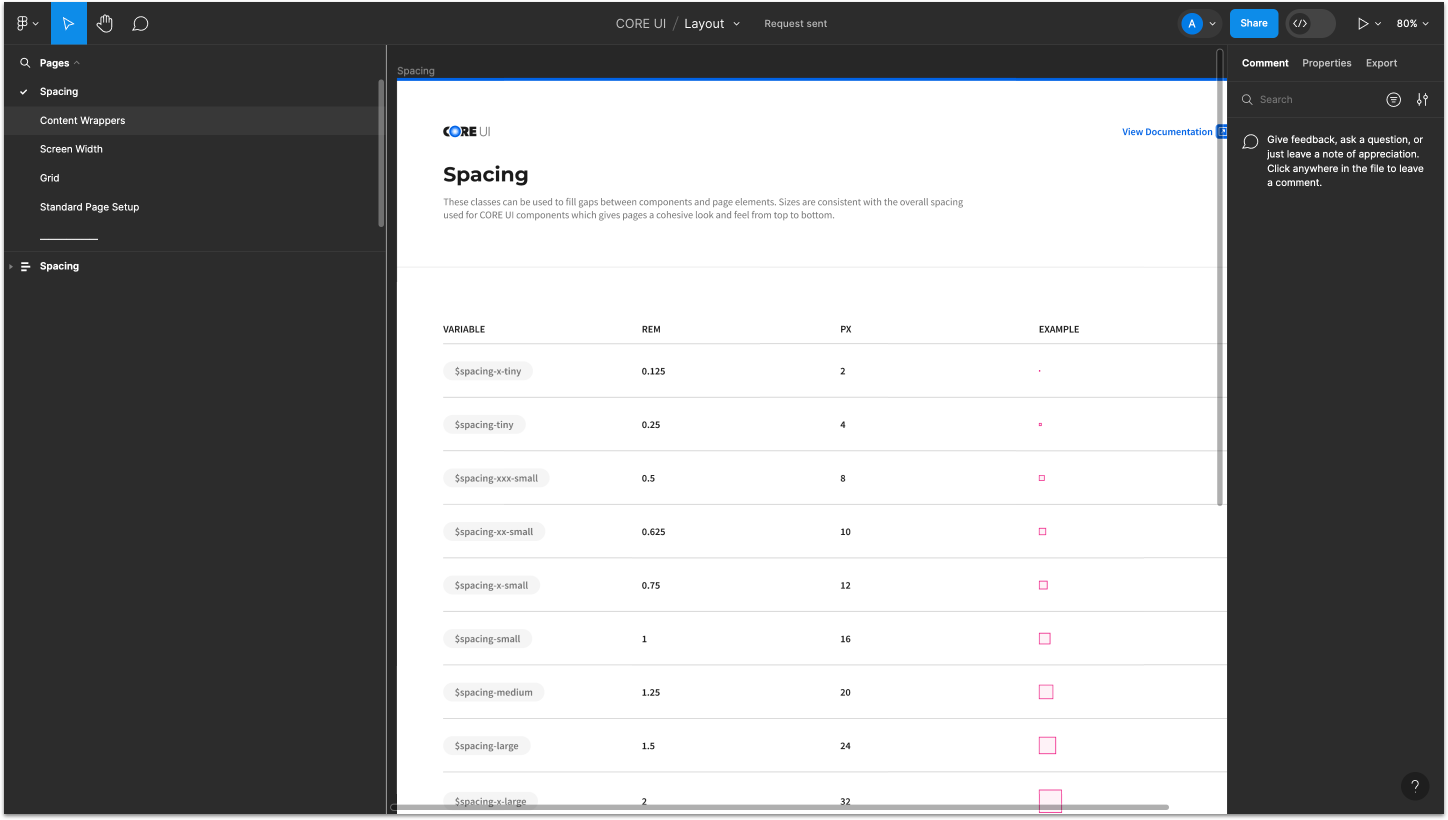
The layout section houses spacing variables, content wrappers, screen width, grid, and standard page setup. All of these are necessary for building out product screens.
Part 3 - Building Components
Next came the fun part — building the component library. With the library being so large at 40+ components, it was important that we standardize a process for efficiency and consistency. We needed to make sure all four of us were building components the same way. Consistency is key for design systems!
Page Label Hierarchy
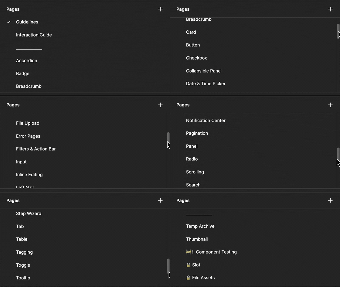
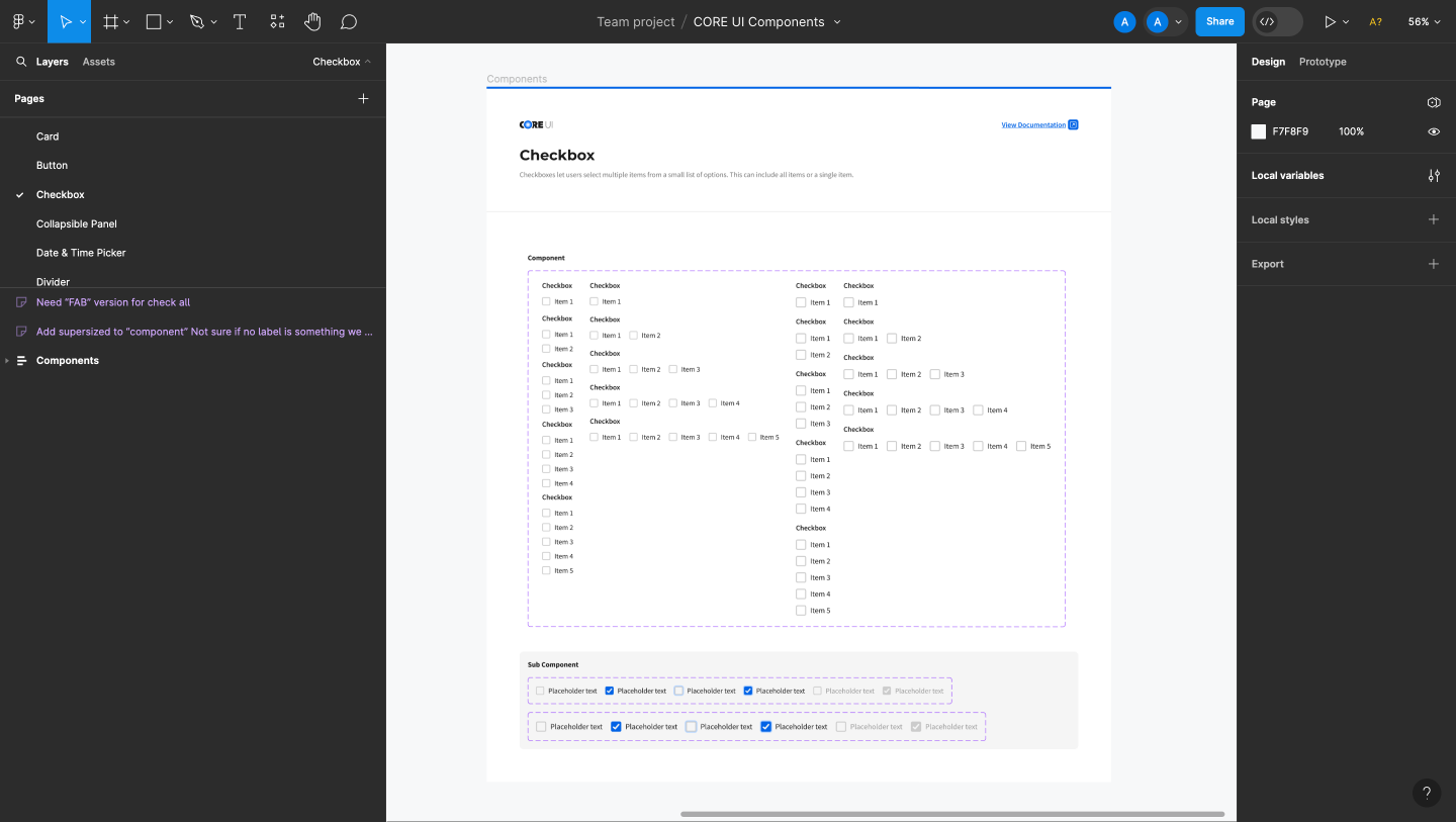
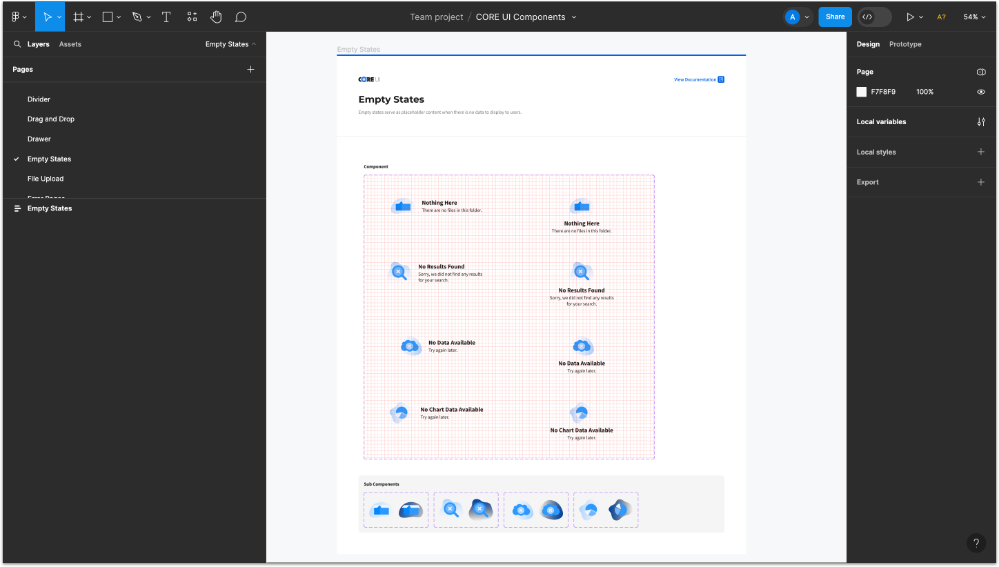
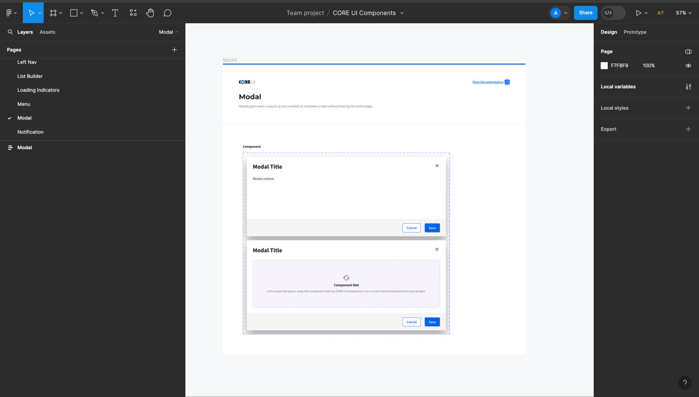
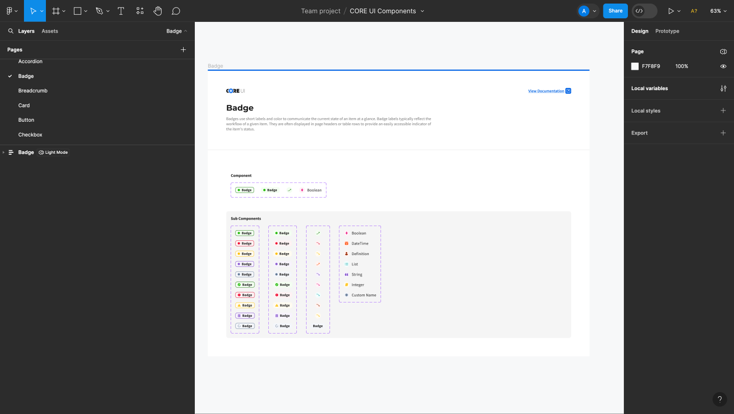
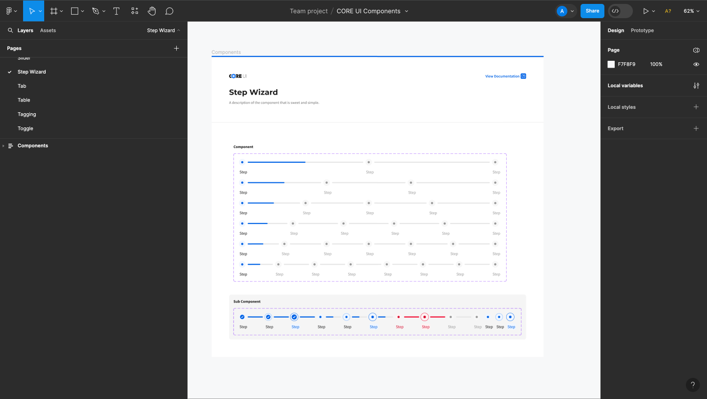
We started off by setting a label hierarchy for each component page. This is what that looks like for the accordion component.
Example: Accordion Component
- PageAccordion
- FrameAccordion
- Autolayout FrameComponents
- Autolayout FrameAccordion Pane
- ComponentAccordion
- Sub ComponentsRow · Row
- ComponentAccordion
- Autolayout FrameAccordion Pane
- Autolayout FrameComponents
- FrameAccordion
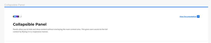
Each page has a short description of the component and a link to the documentation site.
Component Label Hierarchy
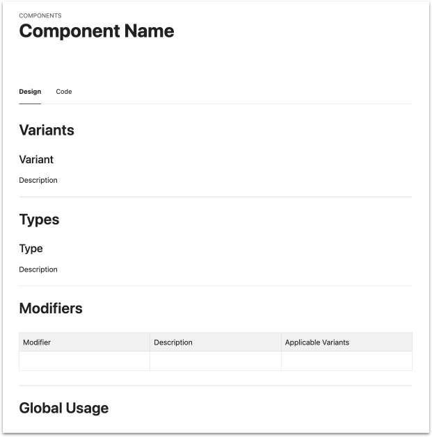
While we were making this new design library in Figma, we were also finishing up a new documentation site for CORE UI. We used specific language to describe the breakdown of components on the doc site and we wanted to keep that wording consistent with the Figma file.
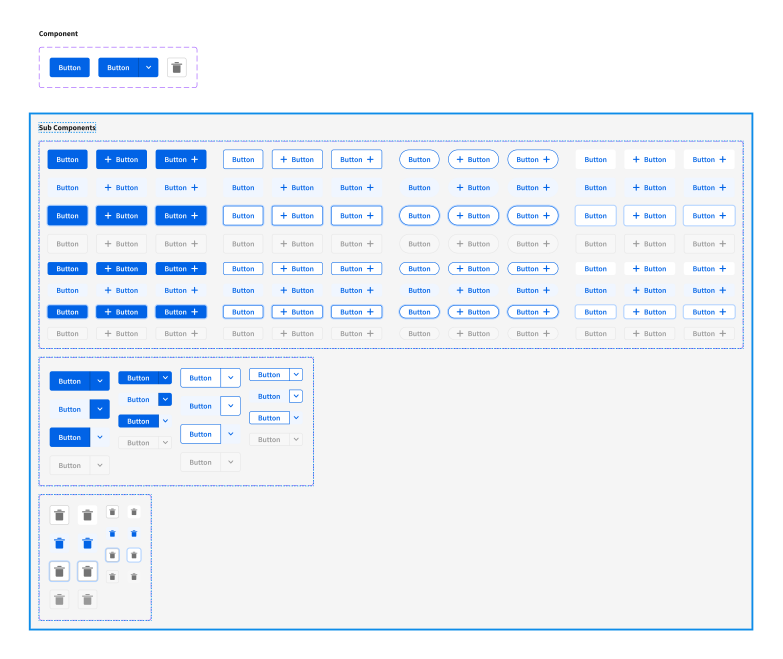
This is how the label hierarchy is used to build the button component, for example.
Example: Button Component
- VariantStandard · Combo · Icon
- TypePrimary · Secondary · Tertiary · Ghost
- StateHover · Focused · Disabled
- ModifiersIcon Right
- StateHover · Focused · Disabled
- TypePrimary · Secondary · Tertiary · Ghost
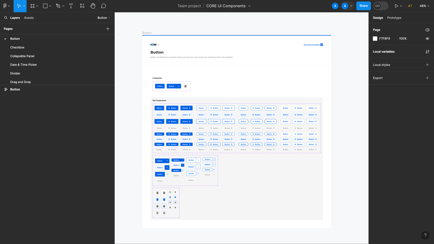
We built out every variant of every type of component with every possible state and modifier.
Prototyping Components
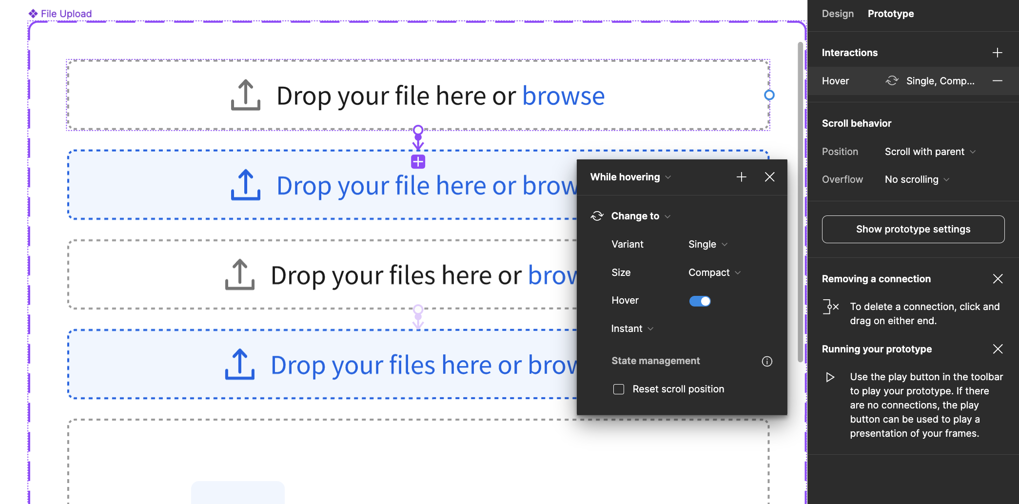
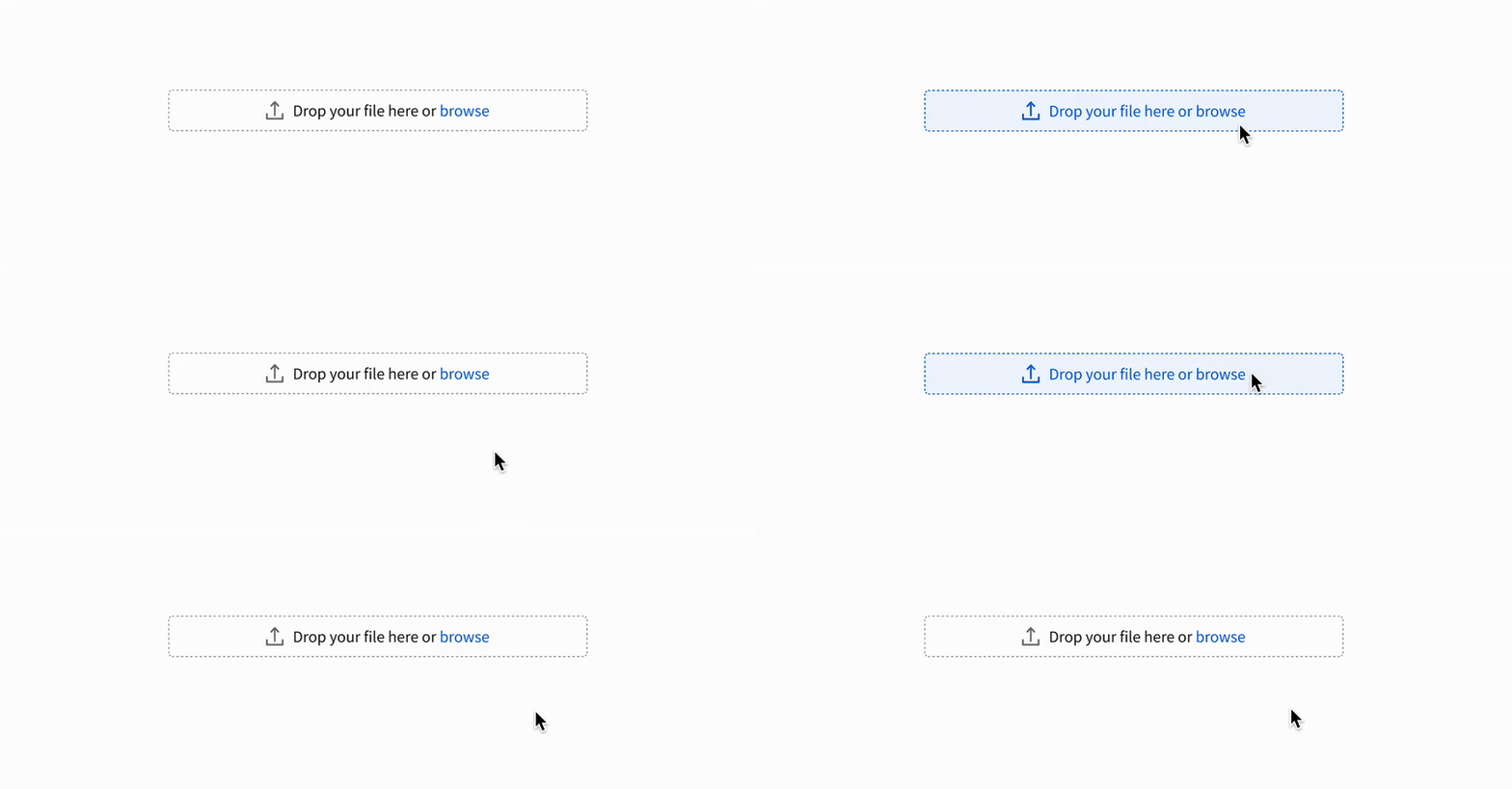
We took advantage of the prototyping feature in Figma and made the components interactive. This way, when they’re added to product screens and are part of prototypes later on, they will already have some interactive functionality.
Accessibility
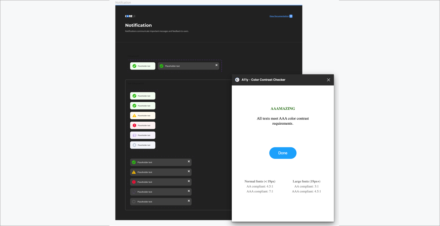
WCAG accessibility was top of mind while building the CORE UI library in Figma. In order to ensure accessibility, I installed A11y plugin to check color contrast.
Part 4 - Results
Outcome
The entire Epsilon design team successfully migrated to Figma, with CORE UI rebuilt as a shared Figma component library.
The migration preserved the existing design system while introducing reusable components, standardized naming conventions, and a more unified workflow for designers. The new library also aligned with the CORE UI documentation site, creating a more consistent experience across design and implementation resources.